PROJECT OVERVIEW
Booking an online consultation for Mental health app/website for busy professionals , students without having to think about their free schedule or having to go in person to meet the therapist .
Project Duration- 2 months
The Problem -
Booking an online consultation for Mental health app/website for busy professionals , students without having to think about their free schedule or having to go in person to meet the therapist .
Project Duration- 2 months
The Problem -
I found that the busy professionals do not have time to go to therapist and trying to deal with their thoughts on their own which is making their life worser and worser . Students who are unable to go to seek help outside for the shame of stigma in society are suffering .
The Goal-
The Goal-
Goal of the app /website is to be able to find help by seeking a therapist and being able to talk to them without having to go to meet them in person.
My Role-
UX designer leading the app and responsive design from conception to delivery
UX designer leading the app and responsive design from conception to delivery
Target Audience- are busy professionals who do not find time to go to a therapist in person and college going students who do not want to bother their family and want to solve their problems by themselves .
Key Challenges/ Constraints-
Whether online therapy works for them or with their limited time how will they able to connect with the therapist whom they can relate with and be able to communicate to talk about their issues with them more comfortably.
Key Challenges/ Constraints-
Whether online therapy works for them or with their limited time how will they able to connect with the therapist whom they can relate with and be able to communicate to talk about their issues with them more comfortably.
SITEMAP
RESEARCH
Understanding the users -
An audit of a few competitor’s products provided direction in gaps and opportunities to address with the mental health app .
Understanding the users -
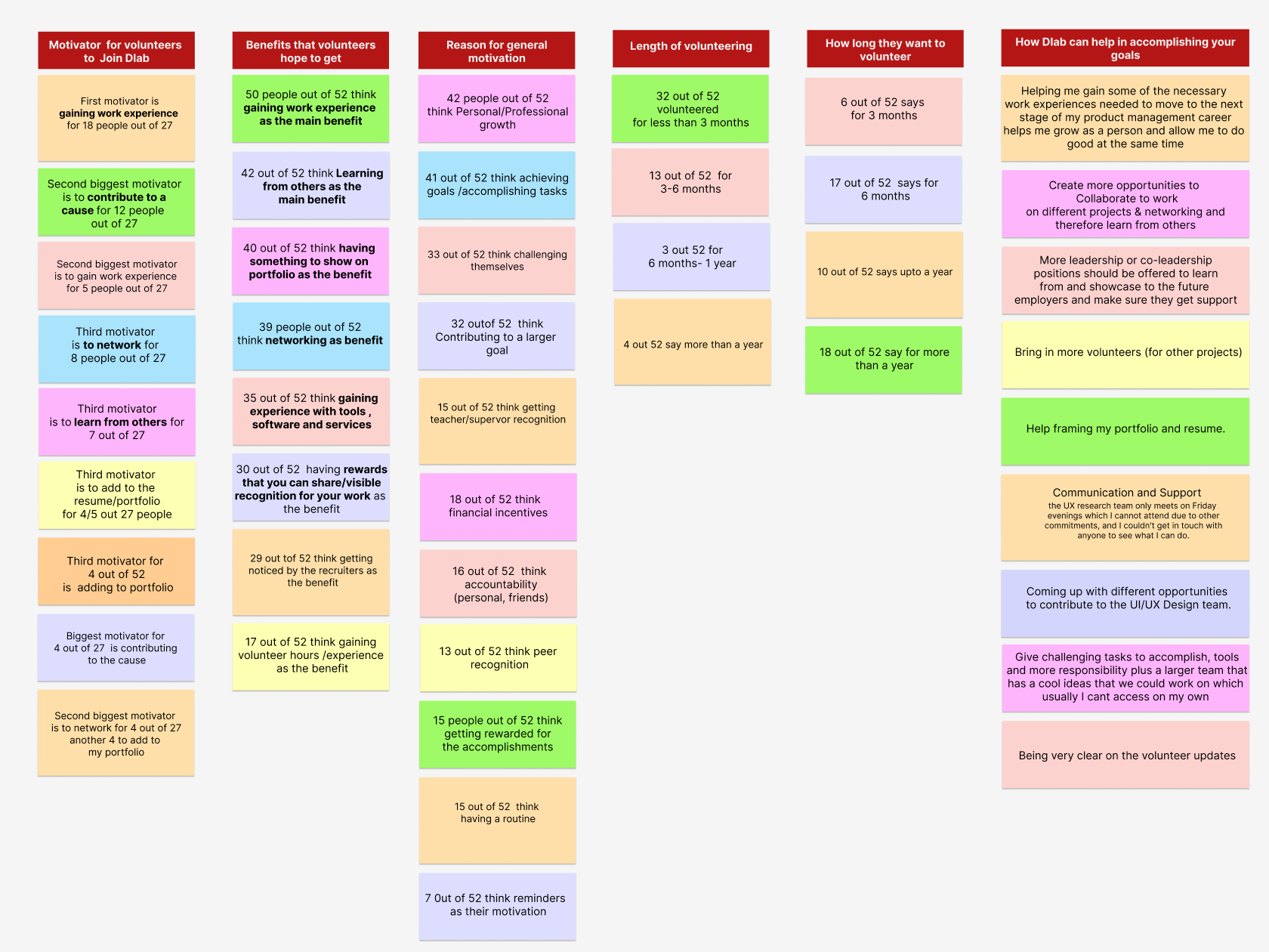
I wanted to know the pain points users experience and their requirements while trying to connect to a therapist , so I designed some interview questions for the users to answer them in user interviews . How would this online appointment be helpful with their schedule ? Are they actually in need of something like online appointments ? After the research I found out that they prefer to look for online appointments whether its on phone call, message or online meeting rather than actually having to go to meet a therapist in person . Also, they wanted to see personalized therapists based on their need so as they open the app/website they see the reviews of therapists after answering few questions on how they are feeling .
An audit of a few competitor’s products provided direction in gaps and opportunities to address with the mental health app .
IDEATION
I did a quick ideation to help identify gaps in the competitive audit . Booking appointment sessions online and choosing therapists as per user’s condition (personalized treatment) is the main focus of my design .
I did a quick ideation to help identify gaps in the competitive audit . Booking appointment sessions online and choosing therapists as per user’s condition (personalized treatment) is the main focus of my design .
DIGITAL WIREFRAMES
After ideating and drafting some paper wireframes , I created the initial designs for the therapyflow app .
In the design , users can select age-wise therapy to look for personalized therapist as per their condition . Sticky menu at the bottom of the app remains on each section to be able to easily to the main menu .
In the design , users can select age-wise therapy to look for personalized therapist as per their condition . Sticky menu at the bottom of the app remains on each section to be able to easily to the main menu .
USABILITY STUDY FINDINGS
Insurance Type- Users are not sure to see further unless they know the insurance type and how much they have to pay from their pocket .
Language and country- Choosing language and region is important from them
Language and country- Choosing language and region is important from them
MOCKUPS and HIGH-FIDELITY
I added apply and clear filters instead of just clicking on options the page goes to a new screen ,now it will go only when the user clicks on apply and can cancel it by clicking on the option or clear filter.
After usability study , I found out that clicking on the options again to cancel the option in filtered list is easier for users to go back .
HIGH FIDELITY PROTOTYPE
User flow starts from answering few questions based on the condition to find personalized therapists and bookings an online appointment with them easily
https://www.figma.com/proto/hVsPRqXx2sxMh3Y85ZWtFK/sitemap-mental-health-app?page-id=0%3A1&type=design&node-id=304-6841&viewport=-748%2C9277%2C0.82&t=EgJevJ3H8Ai7fGbf-1&scaling=scale-down&starting-point-node-id=2%3A17&mode=design
IMPACT
Users can find their therapists online without having to actually go in person for appointment so they can easily book therapists online conveniently on web .
Users can find their therapists online without having to actually go in person for appointment so they can easily book therapists online conveniently on web .


