

Homepage
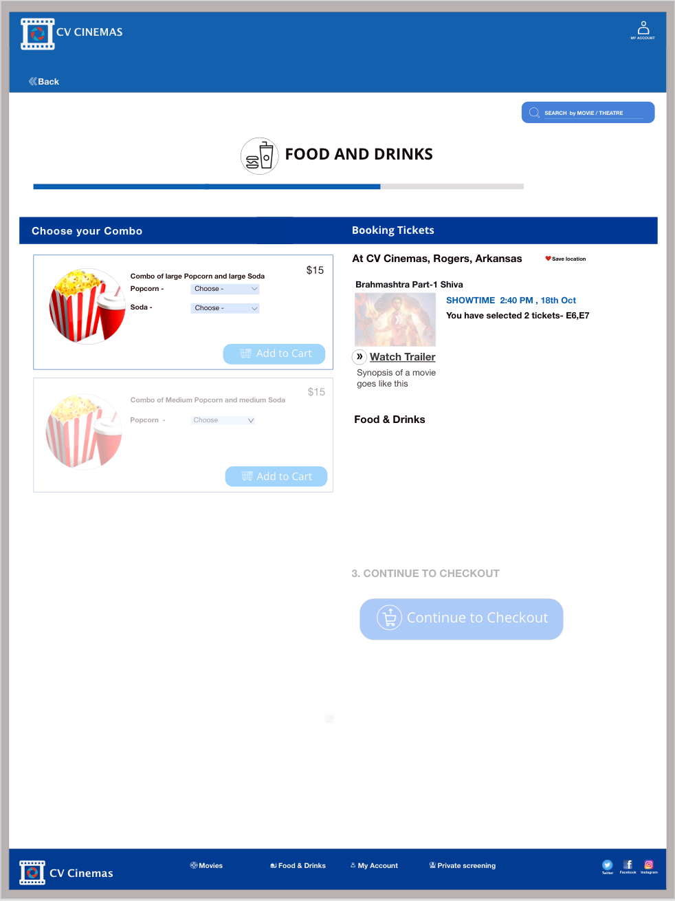
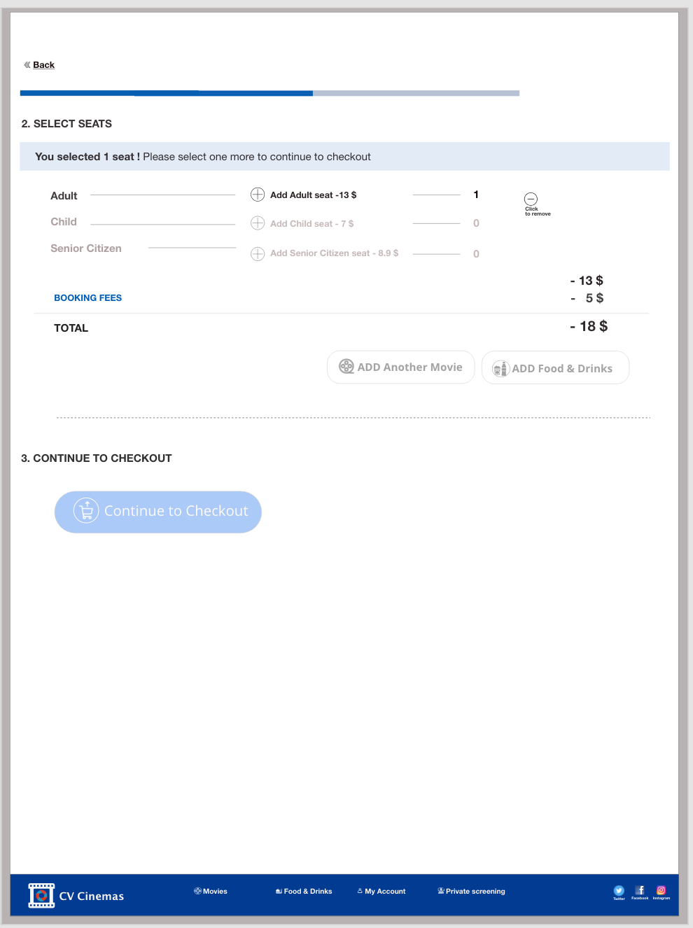
Order Page


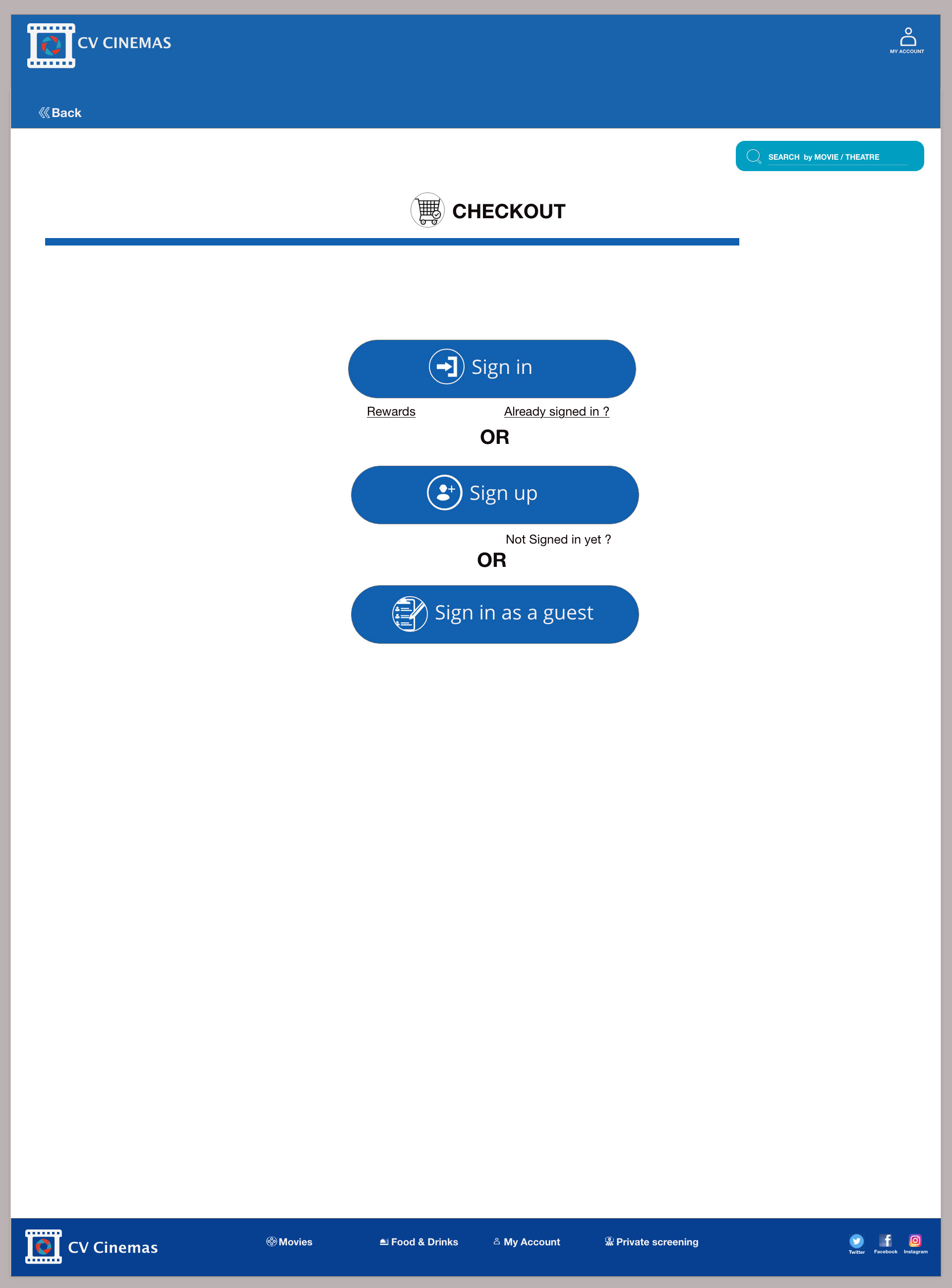
Checkout Page
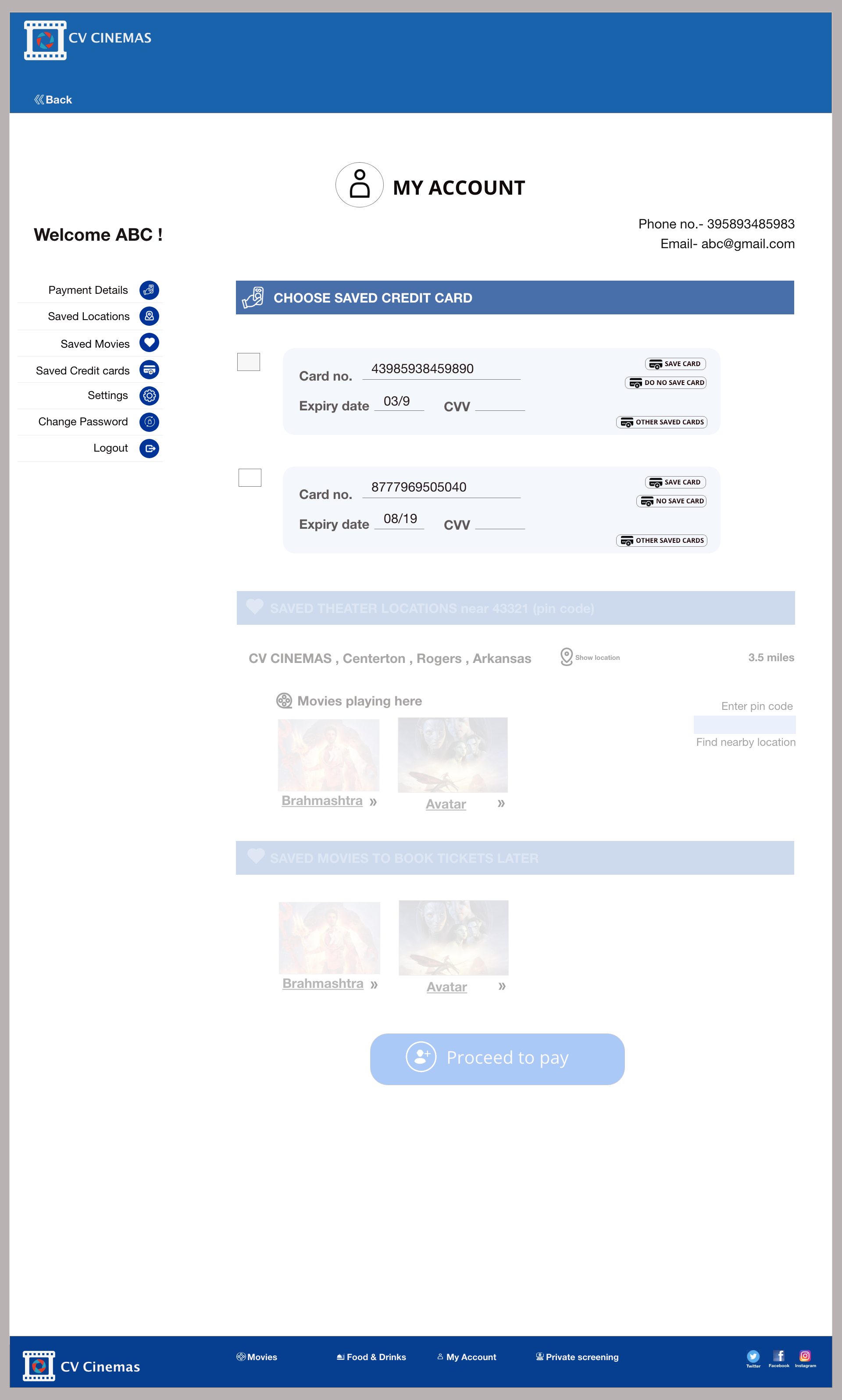
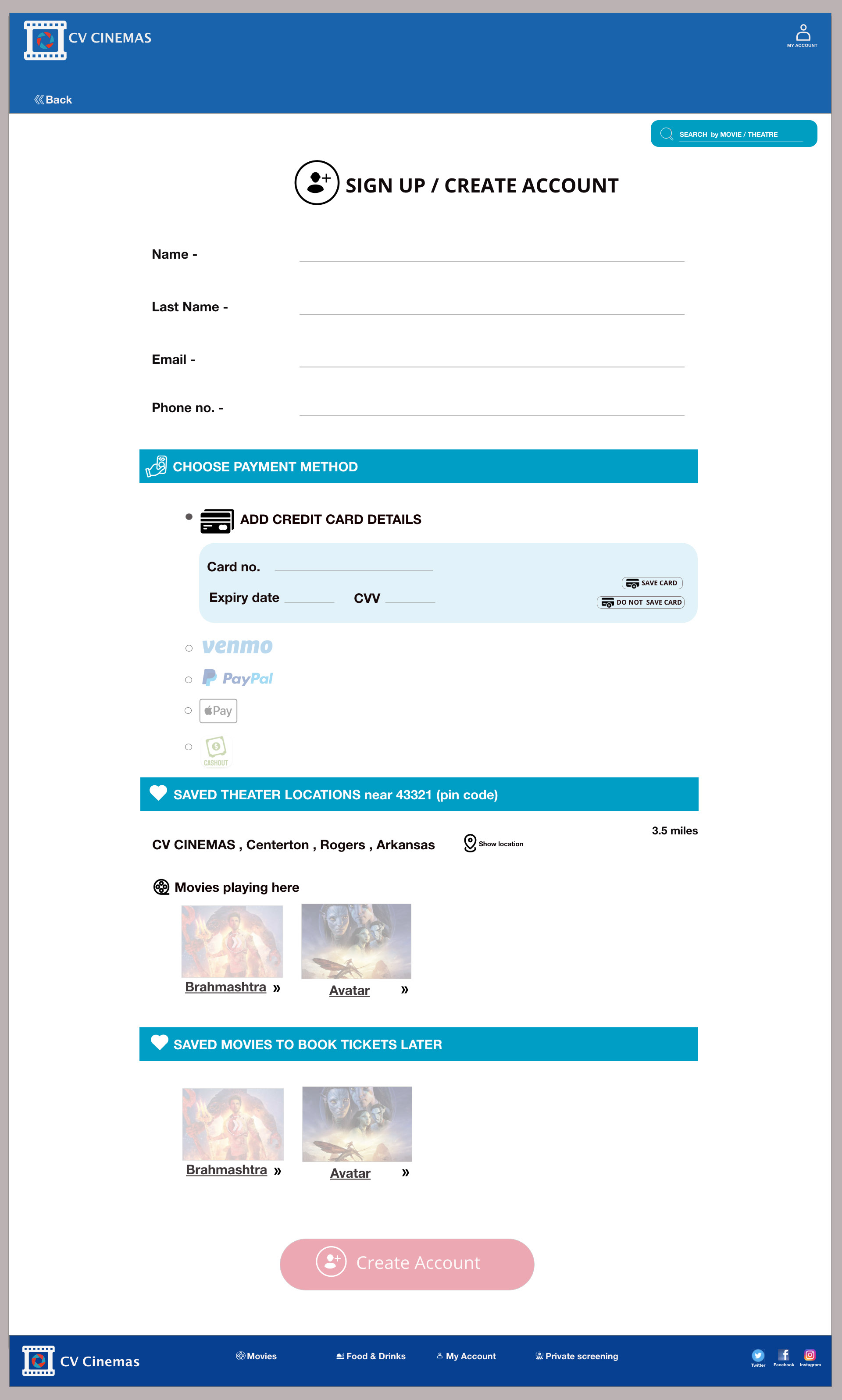
My account
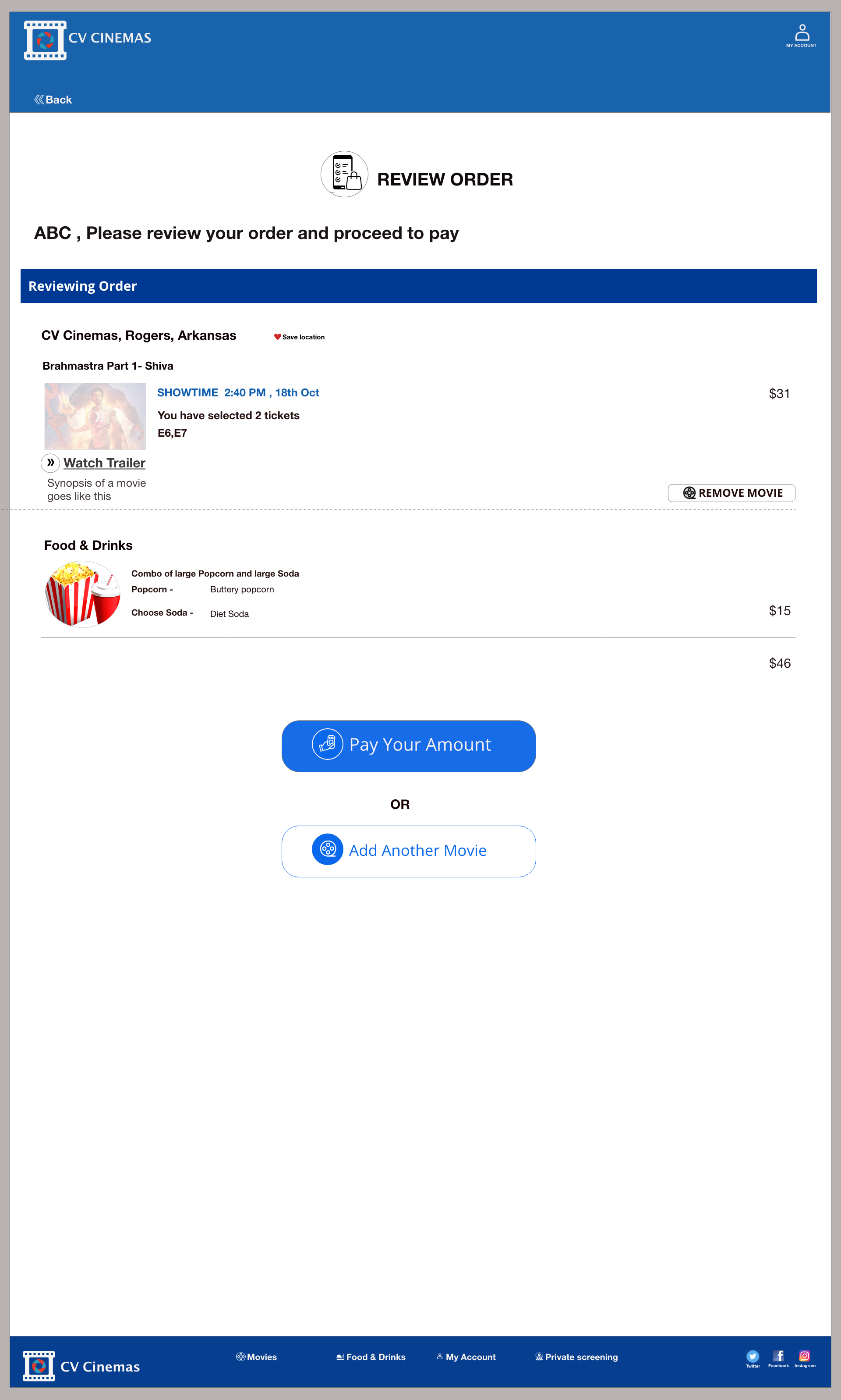
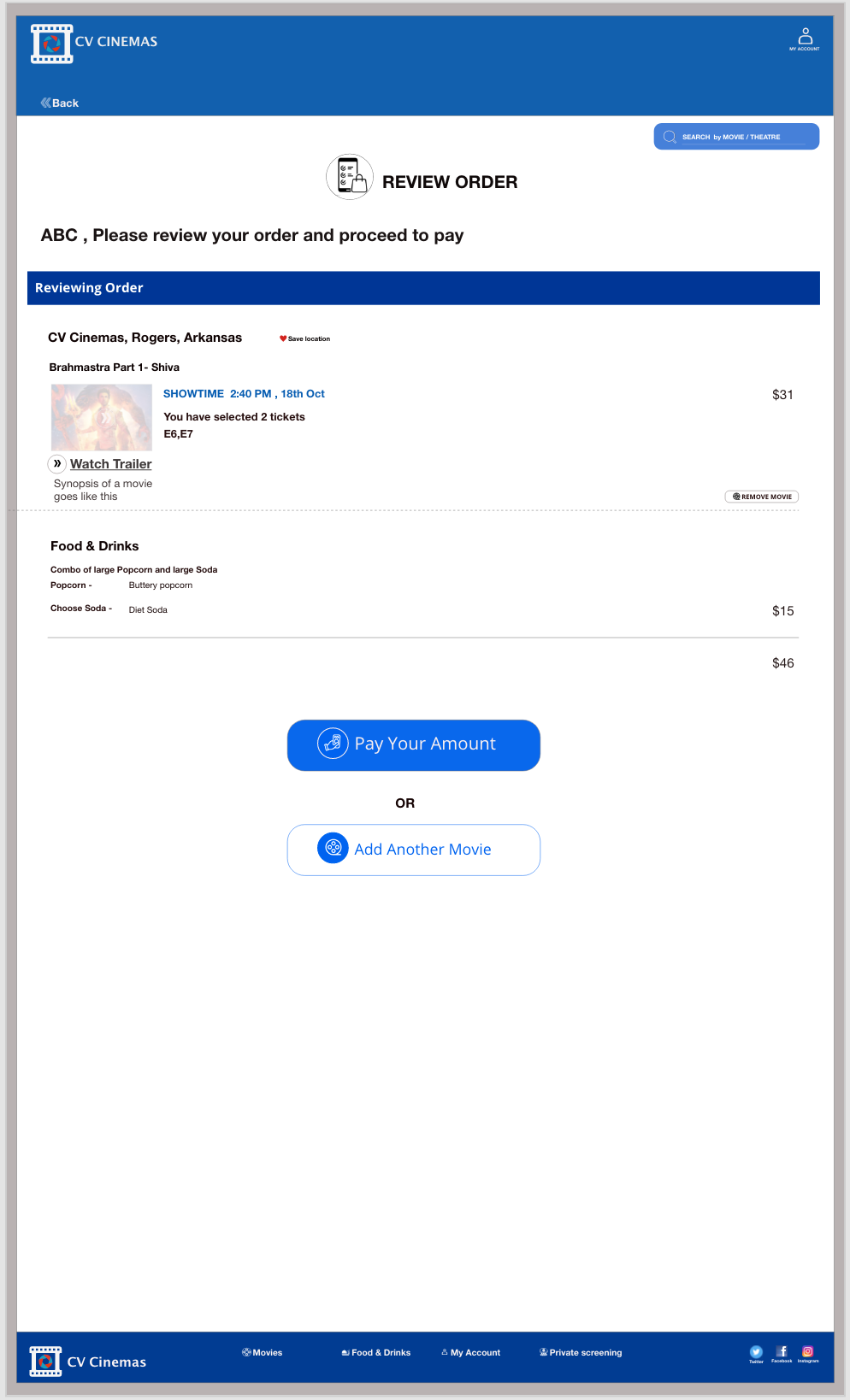
Review order
The goal of the Project - A movie ticket booking website where the users can book their movie tickets online without the hassle of going and waiting in the theater in person and realizing they are not left with any seats or they are not getting the preferred seats.
Different phases in the project -
Empathize -> Define -> Ideate -> Prototype -> Test
Different phases in the project -
Empathize -> Define -> Ideate -> Prototype -> Test
My role in the Project - was that of UX designer where I did research on the kind of users for my product and based on that I made sketches and wireframes by ideating on the problems to find the solution
Key Challenges - There are many options to choose from booking tickets online so the users are not sure which website to go for to book their tickets and how can they find nearby theaters so they do not have to find theaters near them. Also, users are looking for the process to be user-friendly with less no. of steps.
Key Challenges - There are many options to choose from booking tickets online so the users are not sure which website to go for to book their tickets and how can they find nearby theaters so they do not have to find theaters near them. Also, users are looking for the process to be user-friendly with less no. of steps.
Solution - I found the solution by showing the users nearby theaters on the website tracking location of the user so it shows only the theaters nearby. Also, I tried to make the checkout process with less no. of steps and easy to follow.
Research conducted - I started my research by gathering data on the people who go to movies and book their tickets using the website or app. I interviewed four users.
Initial Questions I asked from few moviegoers at the start of my research for a movie tickets website -
1). How many times do you go out to watch a movie in a month?
1). How many times do you go out to watch a movie in a month?
2). How do you book your tickets to go to a movie?
3). What problem do you face when you are trying to book tickets online?
4). Are you satisfied with the payment process?
5). What is one thing you would like to change on websites that you visit to book movie tickets?
6). What features do you like on a website where you book tickets for a movie?
Based on their answers I created personas on the basis of the user groups I discovered and thereby created an empathy map for those groups.
PERSONA OF GRACMI
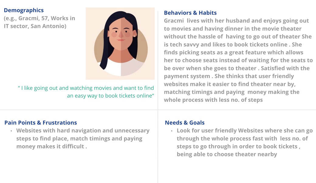
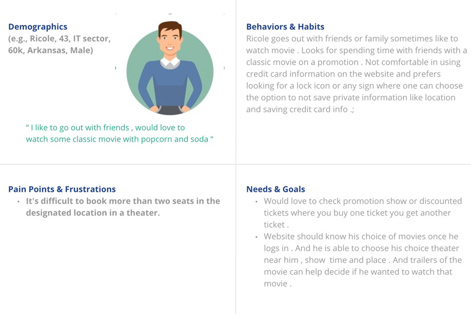
PROBLEM STATEMENT- Gracmi is a Tech savvy person and enjoys going out she needs to find an easy way to book tickets online because booking seats with less no. of steps to follow and which theater to look for is hard as there are many options to choose from.
PERSONA OF RICOLE
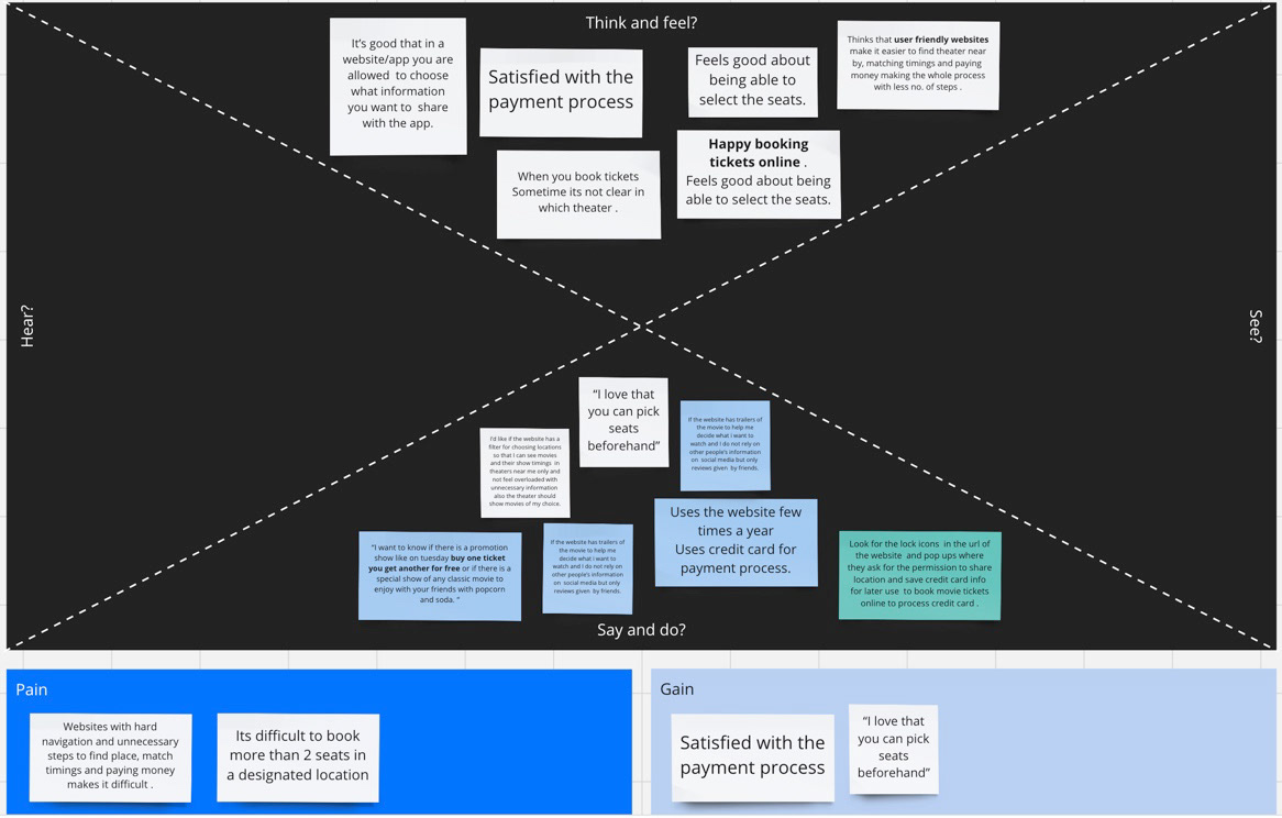
EMPATHY MAP from both the personas
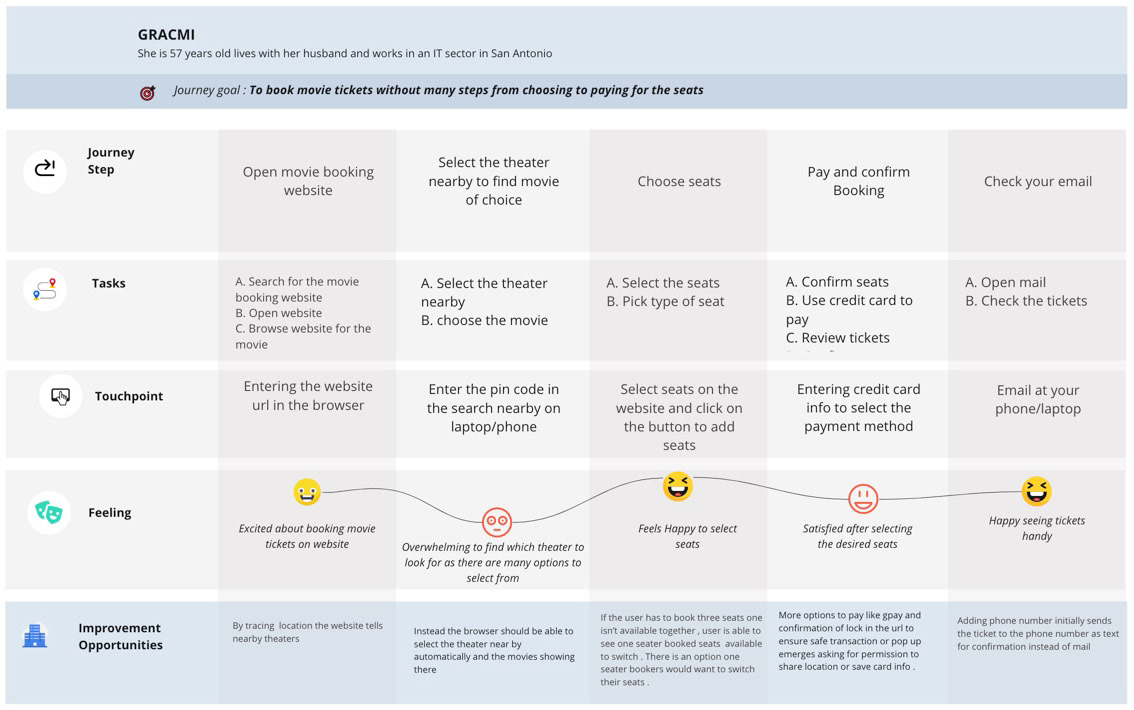
USER JOURNEY MAP
After empathizing with the users I created a user journey map with a number of steps - A user takes to complete a process like booking a movie ticket
After empathizing with the users I created a user journey map with a number of steps - A user takes to complete a process like booking a movie ticket
Site Map for the hierarchical structure of the website
I started creating a site map to know the hierarchical structure of the complete website before moving to creating the wireframes.
I started creating a site map to know the hierarchical structure of the complete website before moving to creating the wireframes.

IDEATION - After defining the problems based on the persona and user journey of the users for the movie app, I started ideating by HMW and crazy 8 methods -
SOME HMW questions I came up with
1. HMW makes booking tickets online more enjoyable?
2. HMW book tickets online with less no. of steps?
3. HMW helps the users find the nearby theater location without having to actually enter the pin code.
4. HMW help users to choose seats according to their convenience. Can there be a way to switch seats in case the user has a preference for the seat?
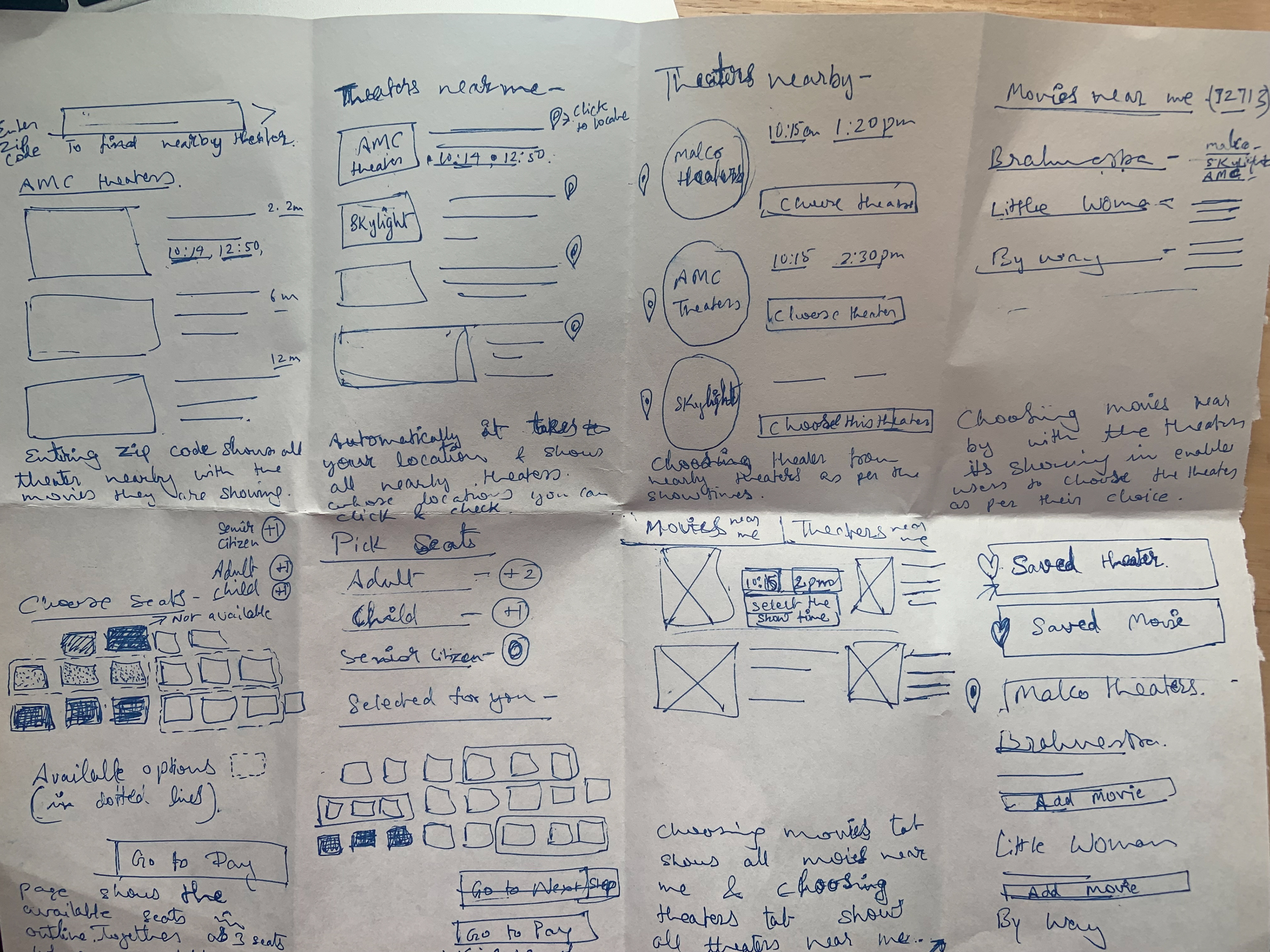
Paper wireframes are drawn and thereafter digital wireframing is done in Adobe XD for the responsive website of the project.
SOME HMW questions I came up with
1. HMW makes booking tickets online more enjoyable?
2. HMW book tickets online with less no. of steps?
3. HMW helps the users find the nearby theater location without having to actually enter the pin code.
4. HMW help users to choose seats according to their convenience. Can there be a way to switch seats in case the user has a preference for the seat?
Paper wireframes are drawn and thereafter digital wireframing is done in Adobe XD for the responsive website of the project.
Crazy8 ideation
According to the persona users goal of the persona is to book movie tickets without many steps from choosing, and selecting the timing to pay for the seats, finding an easy way to book tickets online, and finding which theater to look for as there are many options to choose from easily.
Solutions I came up with -
I tried to solve the problem as the user opens the website it tracks the location and shows the nearby theaters as per the pin code and the movies playing in those theaters so it's less hassle for the users as they don't have to find which theater to look for. And also giving them the option to book food & drinks while inside the theater. And the user is able to get desirable seats while booking by exchanging the seats with one-seaters. From selecting to getting the message on their mobile for their booked tickets, the user goes smoothly on a single page with each step like a progressive disclosure before checking out as a guest, signing in, or signing up /creating an account.
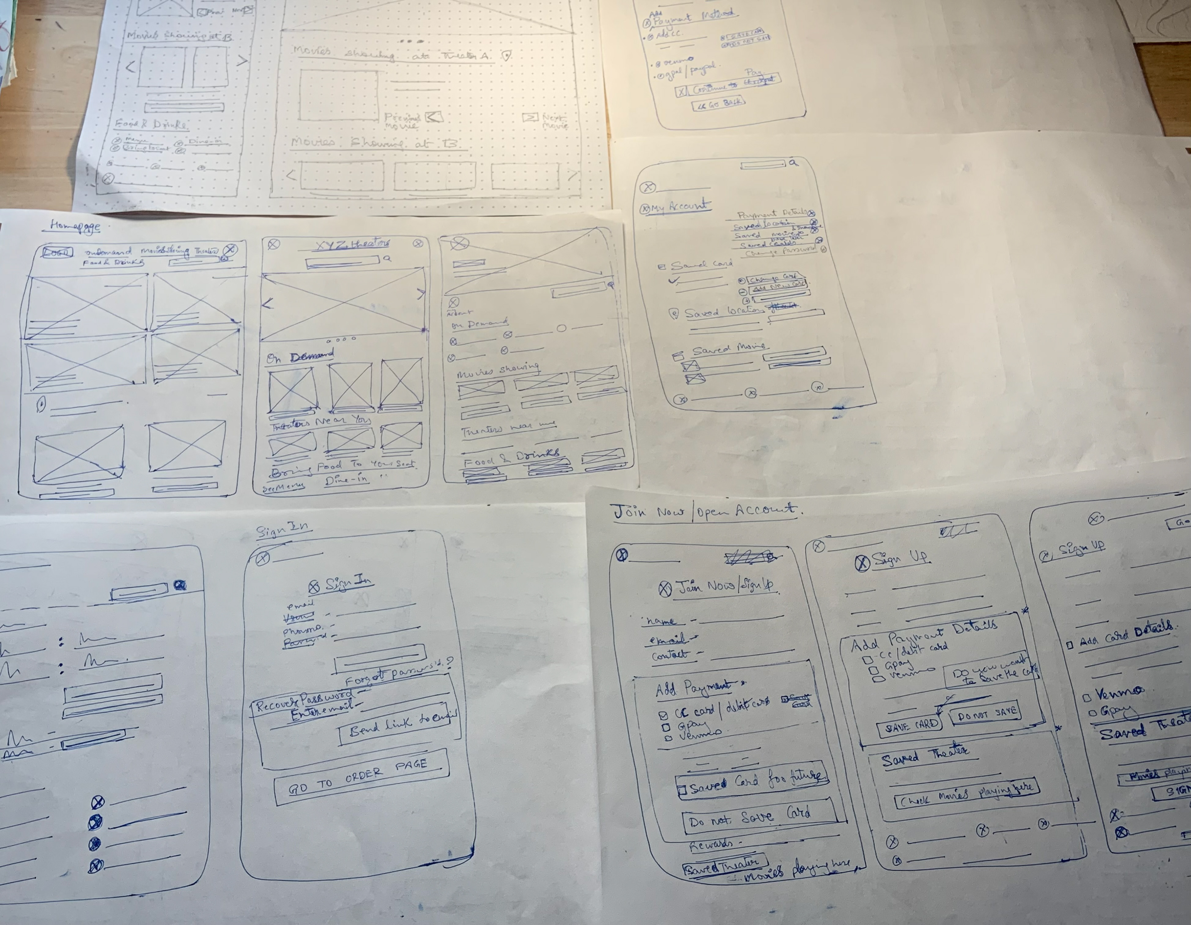
Paper wireframes
PROTOTYPING
I converted sections I liked in paper wireframes into digital wireframes for all pages on Adobe XD and connected the pages for the main flow. Then I conducted an online Unmoderated Usability study for my first low-fidelity prototype with 4 participants of the website for my UX research study.
I converted sections I liked in paper wireframes into digital wireframes for all pages on Adobe XD and connected the pages for the main flow. Then I conducted an online Unmoderated Usability study for my first low-fidelity prototype with 4 participants of the website for my UX research study.
Research goals:
With the website I’m trying to solve the issues users face in booking movie tickets like not being able to book seats at a desired location, easy user flow with less no.of steps, location of the theater is easily understood instead of having to find which theater is nearby and safe transactions where users are asked if they want to save the credit card information or not. So related to these design changes, I aim to find how my design is helping them solve those issues and to what extent.
With the website I’m trying to solve the issues users face in booking movie tickets like not being able to book seats at a desired location, easy user flow with less no.of steps, location of the theater is easily understood instead of having to find which theater is nearby and safe transactions where users are asked if they want to save the credit card information or not. So related to these design changes, I aim to find how my design is helping them solve those issues and to what extent.
The research questions I decided on for the UX research study on the low-fidelity prototype are -
How easy is it for the user to book tickets?
What difficulties does the user find in completing a task?
Does the design help the user in reaching the goal?
Which functionality did the user find most useful in completing the task?
What difficulties does the user find in completing a task?
Does the design help the user in reaching the goal?
Which functionality did the user find most useful in completing the task?
Characteristics of the Participants for the Study -
People who book movies online are too busy to buy tickets later on only to find there are no tickets available or they can’t have desired seats. People who cannot see properly or who have the disability to click by mouse.
The following questions were asked of the users - Prompt 1: Starting on the homepage, find a movie you want to watch at the location you want to watch it
Prompt 1 follow-up: How easy or difficult was this ? Were you able to find the movie and the location where you to watch?
Prompt 2: Select a time and day.
Prompt 2 follow-up: How do you feel about the process and the options available?
Prompt 3: Pick the seats and move to selecting for different people
Prompt 3 follow-up: How easy or difficult was this task to complete? Was there anything you found challenging?
Prompt 4: From the home page, find the movie that want to save or location that want to save for future ?
Prompt 4 follow-up: How easy or difficult was it to find this section of the website? How did you go about looking for it?
Prompt 5: How do you feel entering your credit card info on the website ?
Prompt 5 follow-up:What do you think was helpful and how do you feel about making it better ?
Prompt 6: How do you feel about the checkout process ? Was it easy to follow or did you find any anomaly with that ?
Prompt 7: How did you feel about the xyz cinemas website overall? What did you like and dislike about your experience?
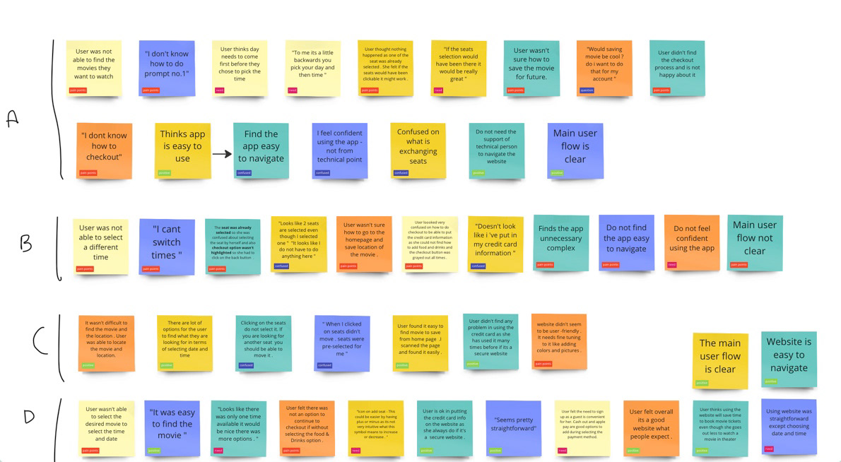
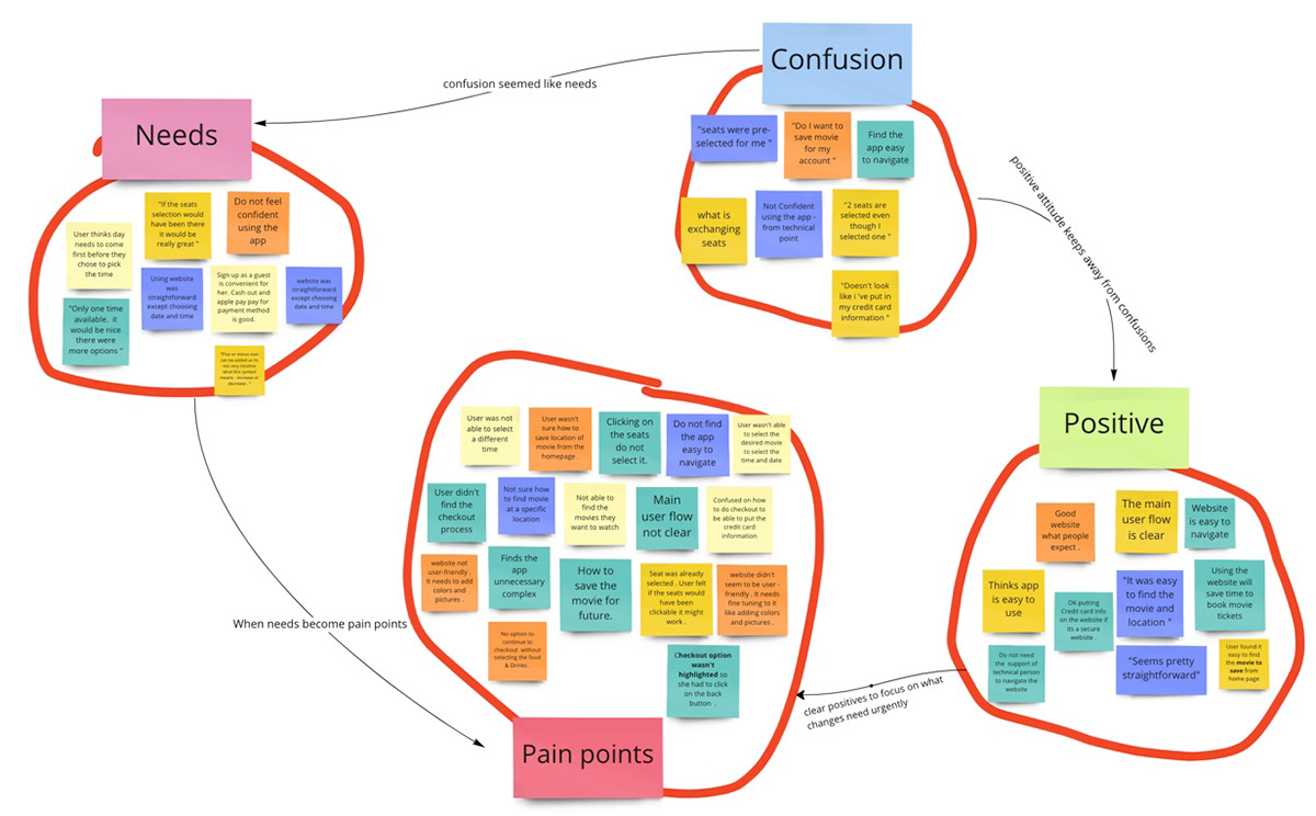
Affinity Diagram
After gaining insights from the unmoderated usability study on the low fidelity prototype , the data has been grouped based on similar participant responses and reactions to usability tasks. First I put all of our observations onto cards (sticky notes), then created the affinity mapping cards using Miro .
I came up with the themes that I found in the research and so I come up with the insights . Some of them are -
I came up with the themes that I found in the research and so I come up with the insights . Some of them are -
1. Most people think there needs to be more options to choose different times, an insight is: different times should be given for user to choose .
2. Most people think they cannot select different seats as it was already selected for them, an insight is: all seats must be selectable or else those 2 seats must be shown in lightest color to select them in question itself .
3. Most people could not find the checkout process if they are not selecting the food & drinks, an insight is: even without selecting food and drinks a user should be able to checkout and clear instructions need to be provided for checkout .
4. Some people didn’t find the user flow clear so they didn’t find the website user-friendly, an insight is: user flow needs to be clear and easy for the user to follow.
5. Some people found it difficult to save location or movie, an insight is: how to save movie or location .
From this data , I came up with prioritized insights for 2-3 most important design tasks I need to reach the the goal of this responsive website .
Based on these prioritized insights I made changes in my design. Here is the modified version of the design after changes -
From this data , I came up with prioritized insights for 2-3 most important design tasks I need to reach the the goal of this responsive website .
Priority 0
Based on the theme that: most people think there need to be more options to choose different times, an insight is: different times should be given for users to choose.
Based on the theme that: most people think they cannot select different seats as it was already selected for them, an insight is: all seats must be selectable or else those 2 seats must be shown in the lightest color to select them in question itself.
Based on the theme that: most people could not find the checkout process if they are not selecting the food & drinks, an insight is: user flow needs to be clear and easy for the user to follow.
Priority 1
Based on the theme that: some people didn’t find the user flow clear so they didn’t find the website user-friendly, an insight is: the user flow needs to be clear and easy for the user to follow.
Based on the theme that: some people found it difficult to save a location or movie an insight is: how to make it easy to save a movie or location.
Based on the theme that: some people found it difficult to save a location or movie an insight is: how to make it easy to save a movie or location.
Based on these prioritized insights I made changes in my design. Here is the modified version of the design after changes -
Low-fidelity prototype of movie app for a website after gaining insights from the usability study .
High-Fidelity Screens
After iterating on the low-fidelity version, I decided to move towards the high-fidelity screens and prototype the screens by adding fonts for hierarchical structure and adding colors and images to the website.
After iterating on the low-fidelity version, I decided to move towards the high-fidelity screens and prototype the screens by adding fonts for hierarchical structure and adding colors and images to the website.
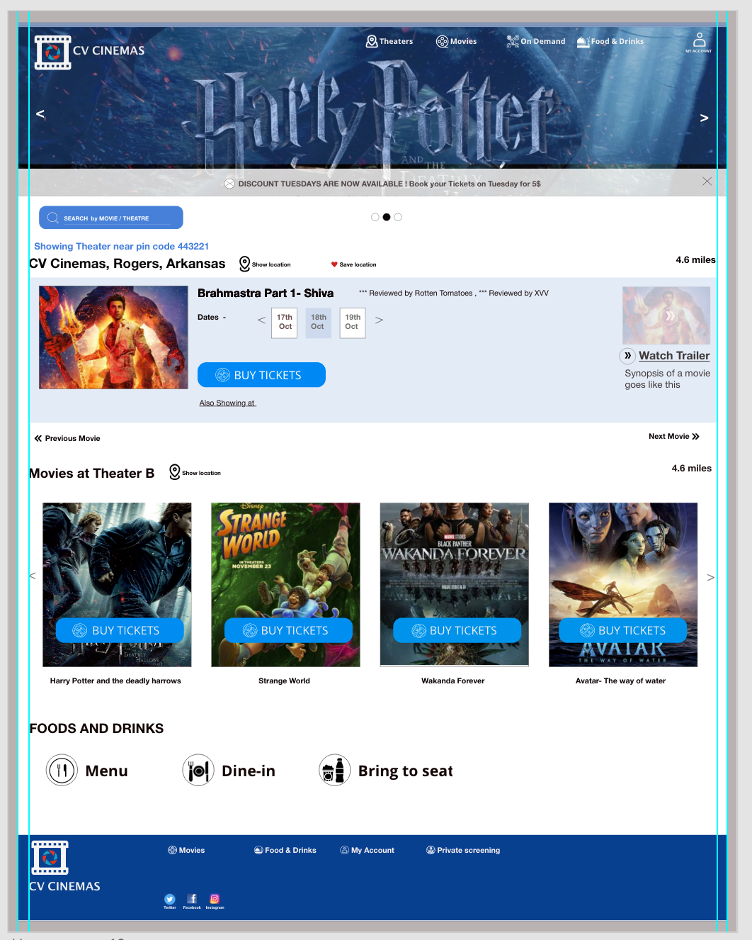
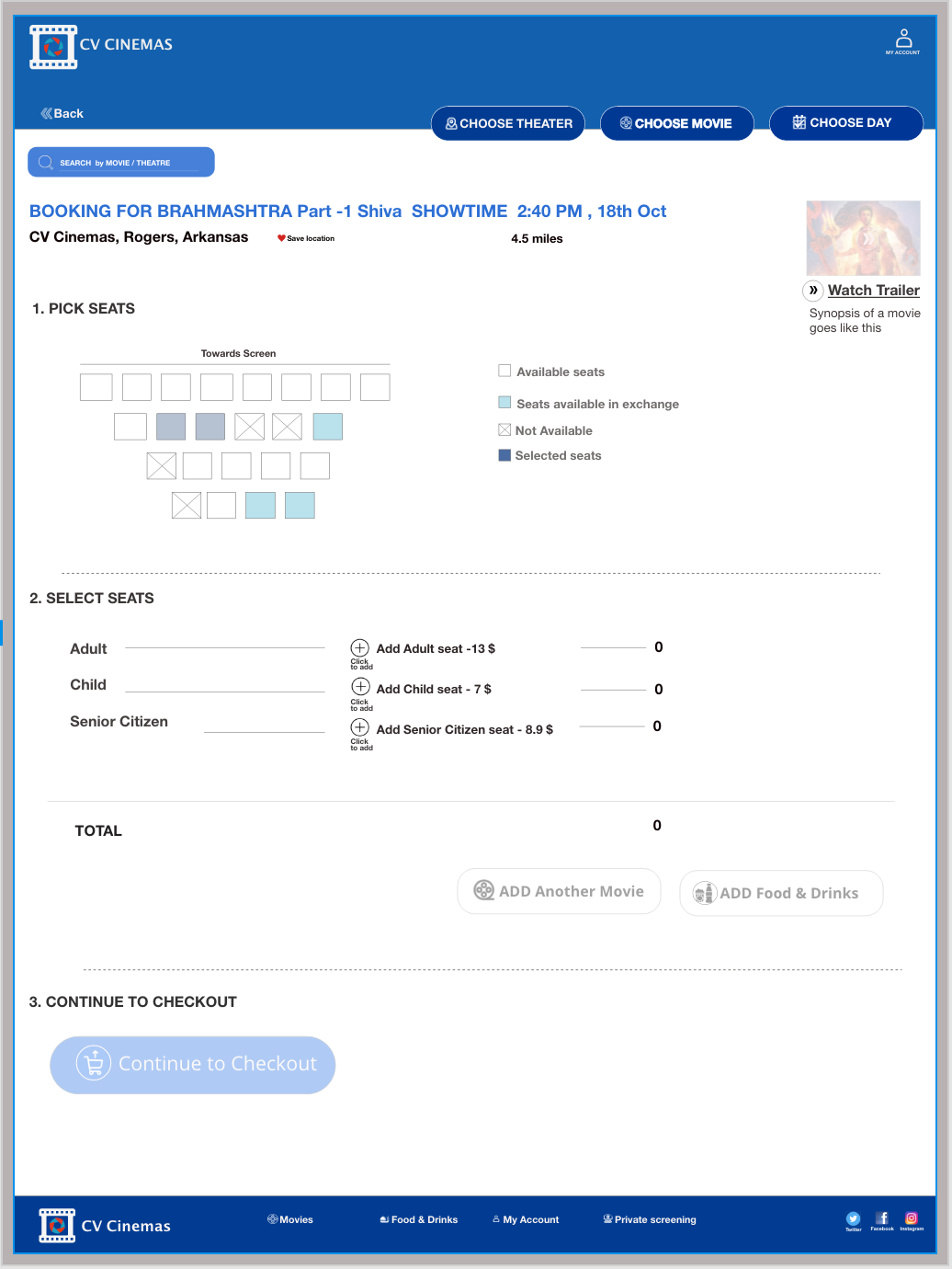
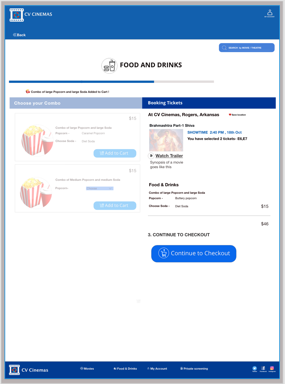
High-fidelity screens of the website